 |
 | |||||||||||||||||
|
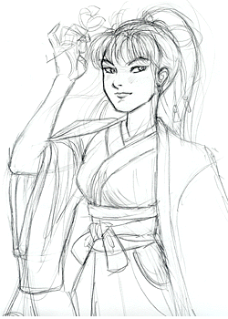
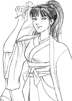
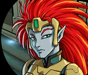
CG 102: Airbrushed Coloring in Photoshop 5.0 [posted 9/27/2000] Here's a demonstration of the slightly more advanced techniques used to create airbrushed and patterned effects. This tutorial assumes you are familiar with the basic techniques presented in CG 101. Again, the version of Photoshop in use is 5.0. Also, when dealing with the airbrush tool, some sort of pressure-sensitive art tablet (such as the Wacom) is nearly a must. Also, I'm dealing here mostly with the mechanics of coloring, and not worrying about things like form and composition... which are, of course, crucial. For this piece, I decided to use a cleaned-up pencil drawing instead of inking the linework. Because (as you can see) the original sketch was quite messy, this still meant tracing and re-drawing Tomoe, being more careful with the pencil lines to get a cleaner image.
Now, that's much easier said than done; it's often very hard to get a second drawing that looks as good as the first one, especially the face. In this case, the original face of the re-drawn pencil (not pictured) turned out very poorly. So, like the good little cheater that I am, I simply cut the "good" face out of the first, rough sketch and pasted it on top of the "bad" face in the second drawing. That's right, cheating in CG is not only allowed, but encouraged (after all, the whole point of using computer tools is to make the work easier). The resulting composite image was then cleaned up with the eraser, and the lines darkened with Image... Adjust... Levels and Image... Adjust... Brightness/Contrast.
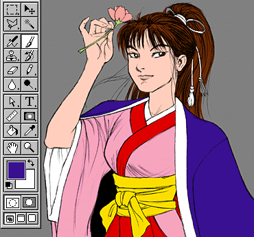
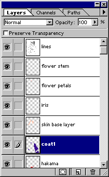
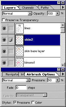
Now, even though I'm going to end up using the airbrush for shading, I start coloring with the paintbrush tool, using a different layer for each color the same way I did for the cel-style piece in CG 101. As before, the reason for doing this is to define the boundaries of each color for later use, so it doesn't really matter what exact color I start with for each area.
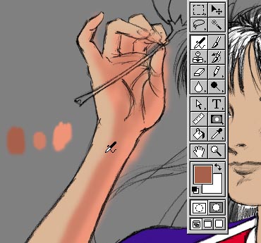
Now for the heavy lifting. I create a new layer (above the skin base layer) for shadows, and switch to the airbrush tool. A basic airbrush setting can be seen below. To avoid blotchiness (the main pitfall of using the airbrush), try to work in smooth, even strokes between one color and another. I usually lay out splotches in an array of colors I plan to use (light to dark); this makes it easier to switch colors with the eyedropper tool (holding down the Alt key while click on the color patch you want to switch to), without fiddling with the color sliders.
Don't worry about staying in the lines; everything outside the base layer (including the palette splotches) will disappear later when we group the layers together. In fact, I deliberately overrun the lines to make sure that the color goes right to the edge. Onward! To Page 2! |